Richmond Chinese School: Enrollment Trifold
Client: The Richmond Chinese School 光華中文學校
Tools: Procreate, InDesign, Illustrator, Photoshop
Tools: Procreate, InDesign, Illustrator, Photoshop
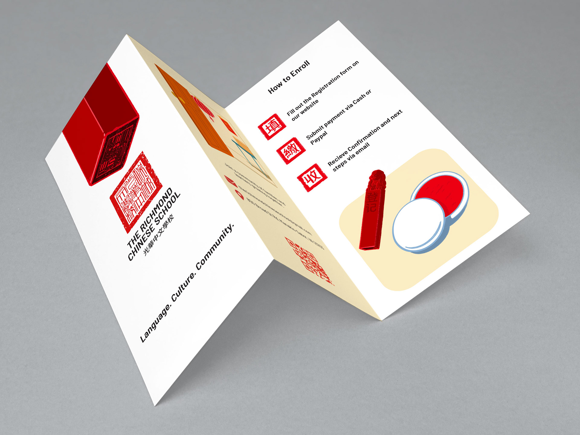
This trifold brochure is aimed at English speakers interested in learning Chinese and heritage speakers. The school’s identity, a community built around language and culture, is expressed through an ink-seal visual language and a cast of illustrated learners of all ages.
Seal and Color System:
Chinese seals, or chops, are carved stone stamps pressed into red ink paste to sign artwork and documents. The school’s logo, its red palette, and the section markers throughout the brochure all grow out of that tradition.
Chinese seals, or chops, are carved stone stamps pressed into red ink paste to sign artwork and documents. The school’s logo, its red palette, and the section markers throughout the brochure all grow out of that tradition.
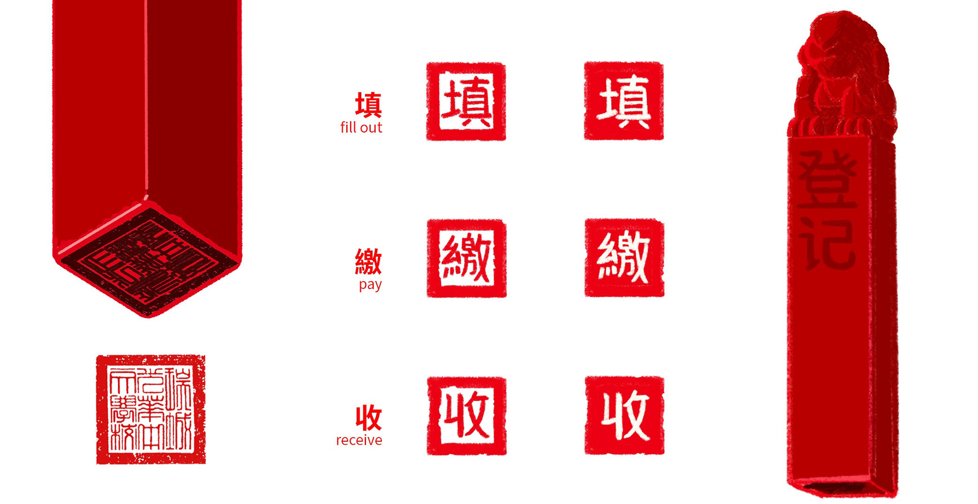

Illustration Process:
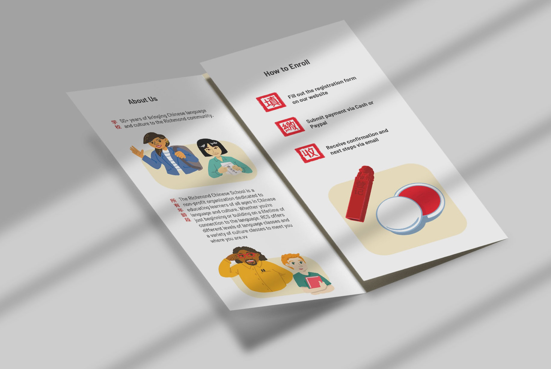
Illustrated characters were built in stages. Basic shapes established pose and proportion, and key features were then added in waves until the character was complete.
Illustrated characters were built in stages. Basic shapes established pose and proportion, and key features were then added in waves until the character was complete.

Chinese & English Type Balance:
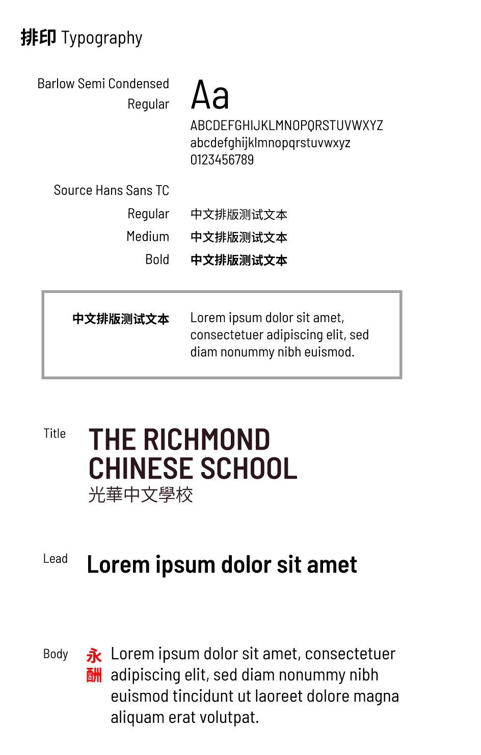
The school’s logo already set the English typeface, so the Chinese was set in a Heiti (黑體), or sans-serif, style, whose even strokes match the English headings’ flat line weight. Setting bold Chinese against regular English body copy is an intentional contrast that lets the Chinese read as a header.
The school’s logo already set the English typeface, so the Chinese was set in a Heiti (黑體), or sans-serif, style, whose even strokes match the English headings’ flat line weight. Setting bold Chinese against regular English body copy is an intentional contrast that lets the Chinese read as a header.
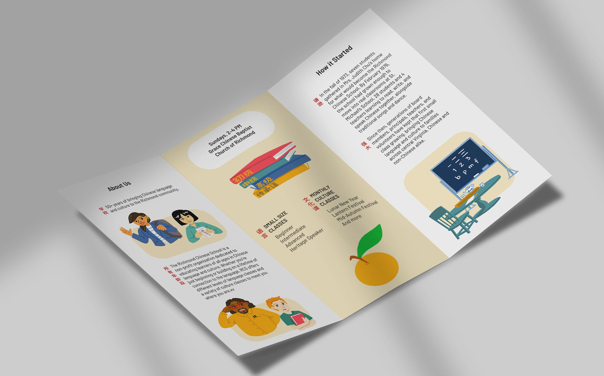
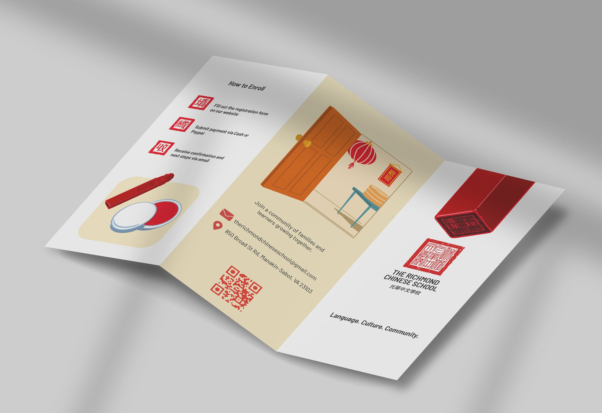
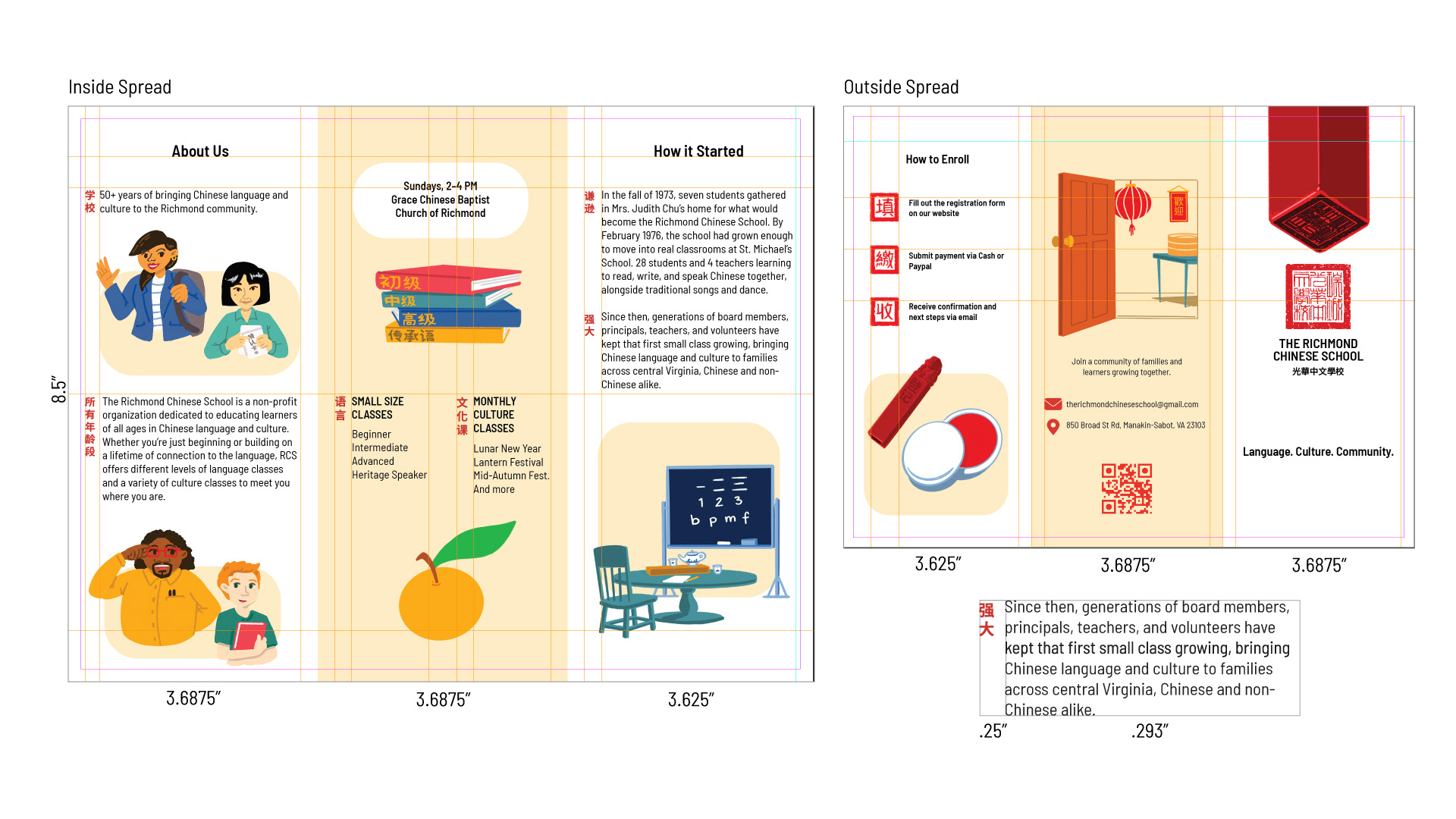
Layout: A roll-fold trifold in letter size, with outside panels for action (registration, welcome, cover) and inside panels for story (about, schedule, history). Each block of English copy is introduced by a vertical Chinese header in bold red, set on a shared grid with consistent margins, gutters, and spacing across both spreads.
Result: Designed as a fixed, reusable template, the brochure can be used by the school every year without redesign. Evergreen content, such as a founding story and a type system that stays readable, keeps the piece current over time.